The Rhetoric of Typography
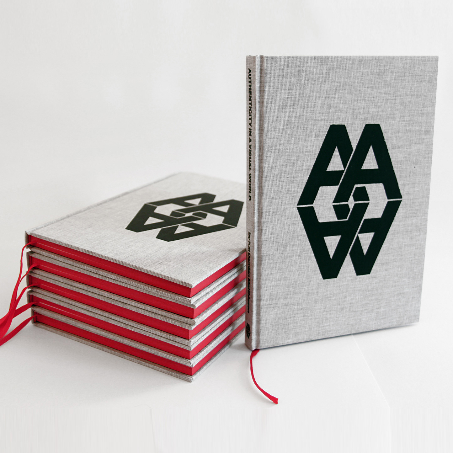
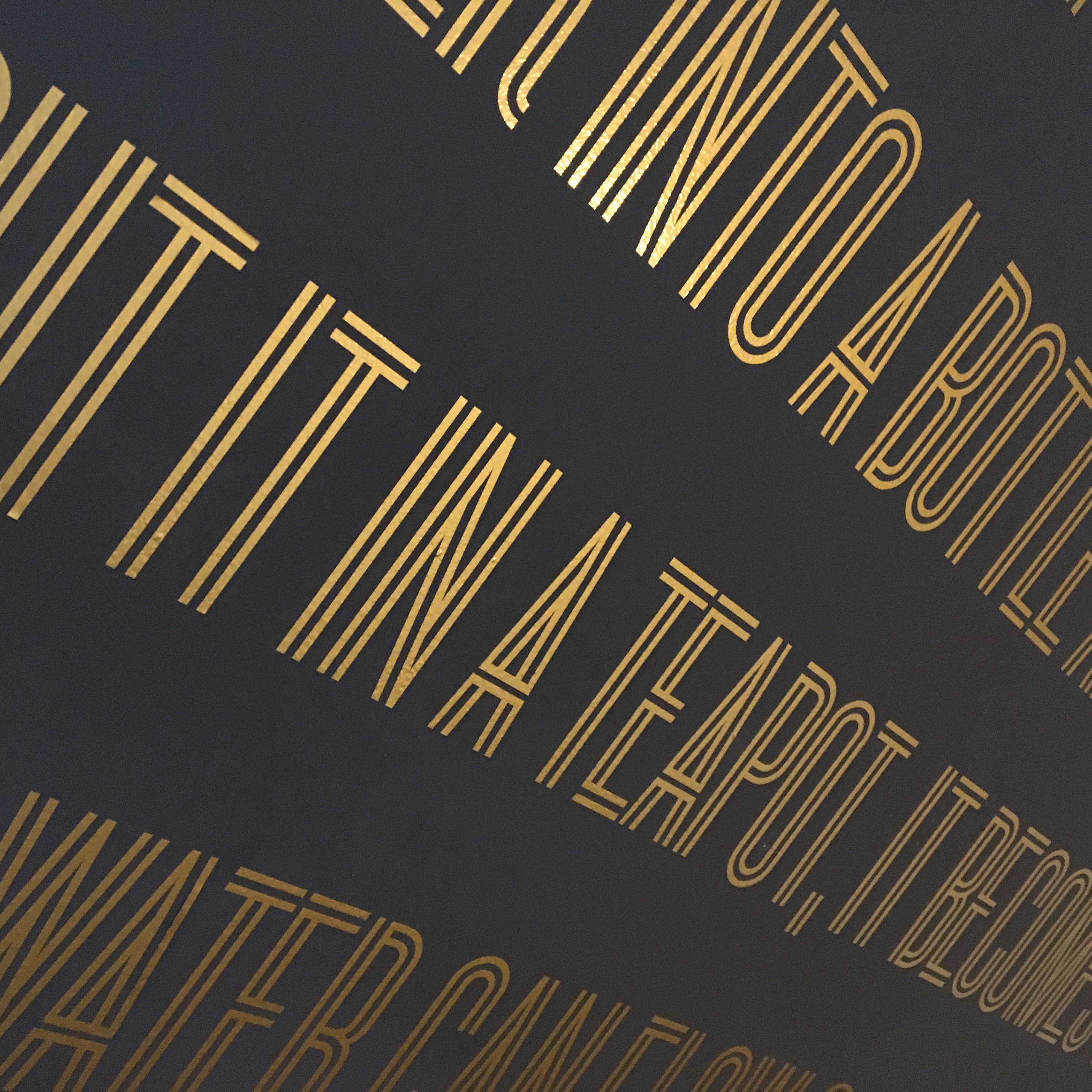
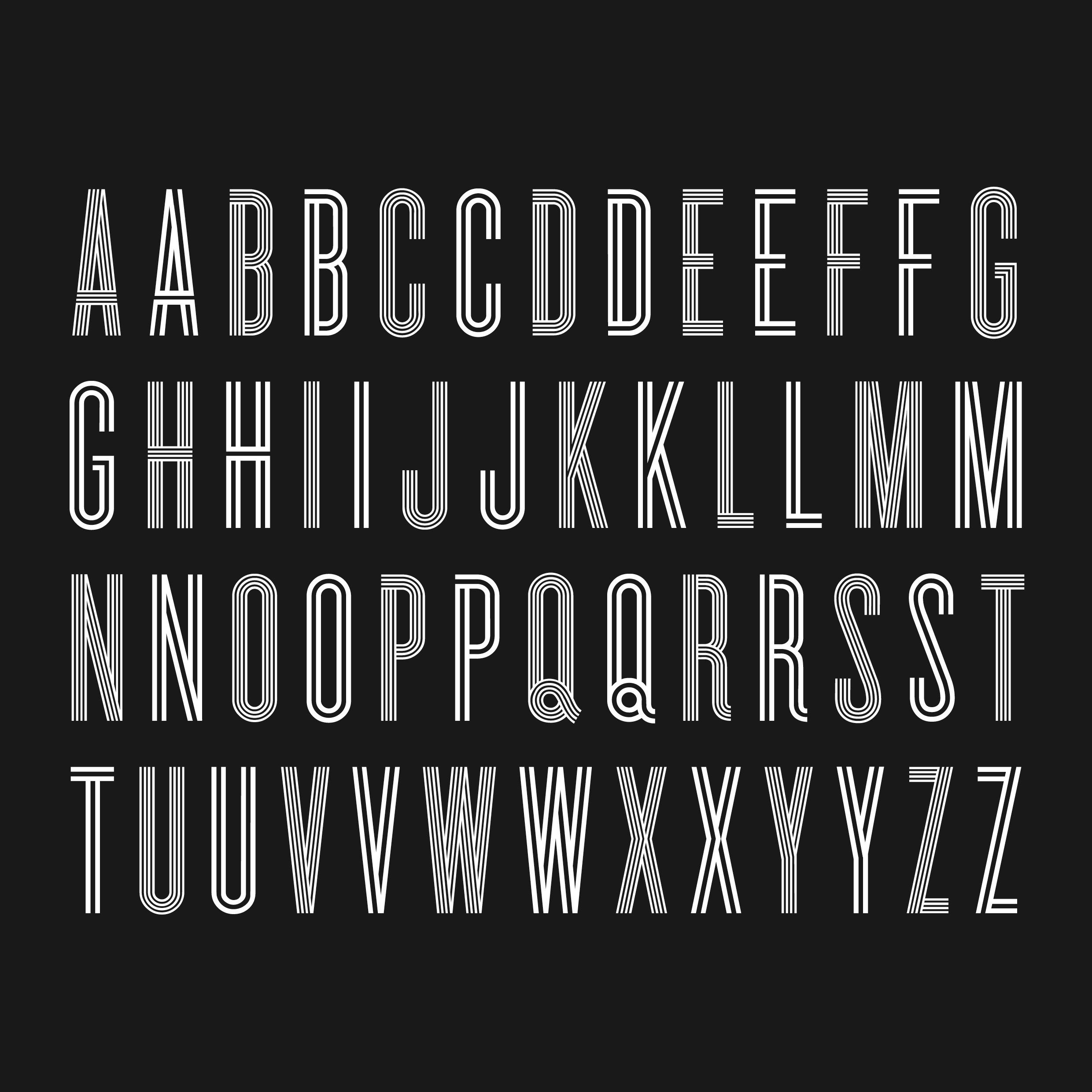
Experimental typography has fascinated me for a long time, already before coming to the RCA. In various projects I had tentatively looked for new ways to explore typography as a form of self-expression. Then in my dissertation “Authenticity in a Visual World” I was interested in a seemingly very different topic, namely the omnipresence of the term "authenticity" in contemporary culture. I wanted to find out, how designers in different fields handle the phenomenon that I called "authenticity pressure" and how it affects their approach to visual communication. By interviewing professionals who face these dilemmas regularly, such as successful designers, but also a tribal tattoo and a commercial street artist, I tried to figure out their strategies to authenticate their work. I then identified four different ways of coping with this pressure: Reinvention of Tradition; Underground, Subculture, Tribal Structures; Tools of the Time; The Cult of Selfhood. Our everyday environments are visual worlds, all the time we are confronted with an abundance of pictures without reference or context. One can only respond subjectively, following inherent (unconscious) selection and aesthetic rules. But to what extent are these decisions made randomly or are rather embedded in our cultural memory? This question led me to the work of Aby Warburg – and then back to experimental typography. There is substantial evidence that type design has a great impact on the reader and that designers and non-designers perceive typography differently. Therefore I looked at existing psychological research that attempts to quantify the effect of typeface designs. I designed a typeface that is equal in its expression by combining traditionally separate categories of typography. “Sans-Serifs” for traits such as Consistency and Logic (Logos), “Humanist” for emotions, imagination (Pathos) and “Serifs” for credibility and trust (Ethos). In Aristotle’s theory of Rhetoric: Logos, Pathos and Ethos are the key dimensions for speaking and communicating effectively. I think that also typefaces communicate and have a kind of rhetorical ability. Therefore I felt the need to investigate to what extent the reader can be influenced by typography. I looked through psychological studies to find three typefaces that can be representative of Logos, Pathos and Ethos and then took their unique qualities in order to design a typeface called Aby Warburg that would be equally unique in it’s persuasive character.
You may also like:
